Color Theory in Interior Design: Creating Harmonious Spaces
The colors we choose for our living spaces do far more than simply decorate—they influence our emotions, affect our perception of space, and can even impact our physiological responses. Color selection is perhaps the single most powerful tool in an interior designer's arsenal, capable of transforming a room from cold and uninviting to warm and nurturing with just a change in palette.
Yet for many homeowners, selecting colors feels overwhelming. The seemingly infinite options, combined with concerns about making expensive mistakes, can lead to safe but uninspired choices. Understanding the fundamentals of color theory as it applies to interior spaces can provide the confidence to make bold, intentional color decisions that enhance both the aesthetic and functional aspects of your home.
The Psychology of Color in Home Environments
How Colors Affect Our Emotions
Colors don't just influence how a room looks—they change how we feel within a space:
Red stimulates energy and appetite, making it excellent for dining rooms but potentially overwhelming in bedrooms. Studies have shown that red environments can actually raise blood pressure and heart rate.
Blue promotes feelings of calm and tranquility, ideal for bedrooms and bathrooms where relaxation is the goal. However, very cool blues can sometimes feel chilly in rooms with northern exposure.
Yellow evokes cheerfulness and optimism, working well in kitchens and breakfast nooks. Its ability to stimulate mental activity makes it suitable for home offices, though too much bright yellow can create visual fatigue.
Green balances restfulness with revitalization, making it versatile for nearly any room. Its connection to nature creates a sense of balance that's particularly effective in transitional spaces like hallways and entryways.
Purple historically associated with luxury and creativity, adds sophistication to formal living rooms or artistic spaces. Lighter lavenders provide a restful atmosphere for bedrooms without the coolness of blue.
Orange combines the energy of red with the cheerfulness of yellow, creating warmth and enthusiasm. It stimulates conversation in living and dining areas but may be too stimulating for relaxation zones.
Neutrals (white, gray, brown, beige) provide flexibility and longevity. They serve as excellent backgrounds that allow architectural features or key furniture pieces to stand out.
Cultural and Personal Associations
Color preferences are influenced by both cultural background and personal experience:
- In many Western cultures, white represents purity and cleanliness
- Red symbolizes luck and prosperity in Chinese culture
- Blue is associated with protection in Middle Eastern traditions
- Yellow signifies mourning in some Latin American countries
- Green holds religious significance in Islamic design
Personal associations may override cultural norms—if childhood memories connect a color with positive or negative experiences, those associations will influence your reaction to that color in your home.
The Color Wheel: A Designer's Fundamental Tool
Primary, Secondary, and Tertiary Colors
The color wheel organizes colors in a logical spectrum, providing a visual reference for creating harmonious combinations:
- Primary colors: Red, blue, and yellow—the foundation colors that can't be created by mixing other colors
- Secondary colors: Green, orange, and purple—created by mixing equal parts of two primary colors
- Tertiary colors: Red-orange, yellow-orange, yellow-green, blue-green, blue-purple, and red-purple—created by mixing a primary with an adjacent secondary color
Understanding Color Properties
Each color has three key properties that affect how it functions in a space:
- Hue: The pure color itself (red, blue, yellow, etc.)
- Value: The lightness or darkness of a color (adding white creates tints; adding black creates shades)
- Saturation: The intensity or purity of a color (fully saturated colors are vivid; desaturated colors appear muted)
These properties provide infinite variation within each color family. For example, within the "blue" family, you might select a pale sky blue (high value, low saturation) for a breezy, light feeling or a deep navy (low value, low saturation) for drama and sophistication.
Color Schemes for Balanced Interiors
Monochromatic
Using variations of a single hue creates a sophisticated, cohesive look:
Application example: A living room in varying shades of blue, from pale sky blue walls to medium blue upholstery and navy accents, creates depth without complexity.
Designer tip: Introduce different textures to prevent monochromatic schemes from appearing flat—velvet pillows, woven throws, and glossy ceramics add visual interest even within the same color family.
Analogous
Combining colors that sit adjacent to each other on the color wheel:
Application example: A bedroom in green, blue-green, and blue creates a tranquil, nature-inspired retreat.
Designer tip: Choose one dominant color, use the second color as support, and the third as an accent to maintain visual balance. The 60-30-10 rule works well here—60% primary color, 30% secondary color, and 10% accent.
Complementary
Pairing colors that sit opposite each other on the color wheel:
Application example: A dining room with deep blue walls and rusty orange accents creates dynamic energy perfect for entertaining spaces.
Designer tip: Complementary schemes can appear jarring if used in equal amounts. Instead, use one color as the dominant tone and the other as a strategic accent.
Split-Complementary
Using one color plus the two colors adjacent to its complementary color:
Application example: A home office with green walls accented with both red-purple and red-orange creates an energetic but balanced workspace.
Designer tip: This scheme provides high visual contrast while being more sophisticated and less tension-filled than a complementary scheme.
Triadic
Selecting three colors equally spaced around the color wheel:
Application example: A child's playroom incorporating yellow, red, and blue creates a primary-colored space that feels cheerful and balanced.
Designer tip: Like complementary schemes, triadic combinations work best when one color dominates and the others serve as accents.
Tetradic (Double Complementary)
Using two complementary color pairs:
Application example: A living room combining blue and orange with yellow-green and red-purple creates a rich, complex color story.
Designer tip: This advanced scheme requires careful balancing—consider using more muted versions of the colors and allowing one pair to dominate.
How Light Affects Color Perception
Natural Light Considerations
The quality and direction of natural light dramatically affects how colors appear:
- North-facing rooms receive cool, bluish light that can make colors appear more muted. Warm colors can help balance this effect.
- South-facing rooms enjoy warm, yellowish light throughout the day, making most colors appear warmer. Cool colors can help temper overly warm spaces.
- East-facing rooms receive bright, yellow morning light and cooler light in the afternoon. Colors may appear to shift throughout the day.
- West-facing rooms experience cool light in the morning and intense, orange-red light in late afternoon. Consider how the space will be used at different times of day.
Designer tip: Always test paint colors on all walls of a room and observe them at different times of day before committing to a final choice.
Artificial Lighting Effects
Different light sources render colors differently:
- Incandescent lighting casts a warm, yellowish glow that enhances reds, oranges, and yellows but can dull blues and greens
- LED lighting varies widely—look for the Color Rendering Index (CRI) on bulb packaging; higher numbers (90+) show colors more accurately
- Fluorescent lighting traditionally gives a cool cast that enhances blues and greens but can make warm colors appear flat
- Halogen lighting provides bright, white light that renders colors fairly accurately
Designer tip: When selecting paint colors or fabrics in a store, always view samples under lighting similar to what you'll have at home.
Using Color to Solve Design Challenges
Manipulating Space Perception
Color can visually alter the dimensions of a room:
- Make a room appear larger: Light colors recede, creating the illusion of more space. Painting walls, trim, and ceiling the same light color blurs boundaries.
- Make a room feel cozier: Darker or warmer colors advance, bringing walls inward for an intimate feeling.
- Raise a ceiling: Paint the ceiling lighter than the walls to draw the eye upward.
- Lower a ceiling: Extend wall color onto the ceiling about 8-12 inches around the perimeter, or paint the ceiling a darker shade.
- Lengthen a room: Paint the shorter end walls a slightly darker shade than the longer walls.
Highlighting Architectural Features
Strategic color placement draws attention to a room's best features:
- Accent colors on fireplace walls create natural focal points
- Contrasting trim colors highlight interesting moldings and woodwork
- Darker colors in recessed areas create depth and shadow play
- Lighter colors on crown molding draw the eye upward
Connecting Spaces in Open Floor Plans
Color creates visual flow between connected areas:
- Use a consistent neutral base throughout main living areas
- Create subtle transitions with graduated intensity of the same hue
- Use accent colors that appear throughout the home in varying proportions
- Consider the view from one room to the next when selecting adjacent room colors
Color in Different Room Types
Living Rooms
As multi-purpose gathering spaces, living rooms benefit from versatile color approaches:
Color strategies:
- Base palettes on key textiles or artwork that you love
- Consider a 60-30-10 distribution (60% dominant color, 30% secondary color, 10% accent)
- Use color to define activity zones in larger living spaces
Designer example: A living room with warm gray walls provides a neutral backdrop for a blue sofa, with mustard yellow and deep teal accents in pillows, art, and accessories—creating a balanced scheme that feels both current and timeless.
Bedrooms
Colors should support the room's primary function of rest and rejuvenation:
Color strategies:
- Select hues based on the psychological effect you desire (calming blues and greens, romantic lavenders, energizing corals)
- Consider using deeper colors for a cocoon-like effect that promotes sleep
- Layer multiple shades of a color family for sophistication without complication
Designer example: A primary bedroom with deep blue-gray walls creates a restful sanctuary, while white bedding and natural wood tones add warmth and prevent the space from feeling too cool or cave-like.
Kitchens
As the heart of most homes, kitchens benefit from colors that feel inviting and energetic:
Color strategies:
- Use cabinet color as the dominant tone in the room
- Consider colorful appliances as statement pieces in otherwise neutral kitchens
- Balance upper and lower cabinets with contrasting colors to prevent visual heaviness
Designer example: A kitchen with navy lower cabinets anchors the space, while white upper cabinets prevent visual heaviness. Brass hardware and fixtures add warmth, and a subtle pale blue backsplash ties the palette together.
Bathrooms
These smaller spaces offer opportunities for color experimentation:
Color strategies:
- Light colors maximize the perception of space in small bathrooms
- Consider the effect of color on skin tone in bathroom lighting
- Use color to create a specific atmosphere—spa-like, energizing, or dramatic
Designer example: A powder room with deep emerald green walls and ceiling creates a jewel-box effect, while simple white fixtures and natural wood elements keep the small space from feeling overwhelming.
Home Offices
Productivity spaces benefit from colors that support focus and creativity:
Color strategies:
- Blues and greens promote concentration and reduce eye strain
- Accents of energizing colors like yellow or orange can stimulate creativity
- Consider the backdrop color for video calls
Designer example: A home office with soft sage green walls provides a calming background for work, while golden yellow accents in artwork and accessories add energy without distraction.
Color Trends vs. Timeless Choices
Navigating Color Trends
Color trends reflect broader cultural moments but change relatively quickly:
- Current trends (as of 2023): Earthy tones like terracotta and olive green; moody blues; warm neutrals replacing cool grays
- Recent past trends: Cool grays (2010s), Millennial pink (late 2010s), All-white interiors (2010s)
- Forecasted directions: Rich, saturated hues; nature-inspired greens; warm, earthy palettes
Designer tip: Incorporate trends through less permanent elements like accessories, accent walls, or smaller furniture pieces that can be changed more easily.
Creating Enduring Color Schemes
Certain approaches tend to have staying power:
- Classic neutrals with targeted color accents
- Nature-inspired palettes that connect to the outdoor environment
- Colors with personal significance rather than those chosen solely for trend value
- Historical color combinations that have proven their longevity
Designer tip: Build core elements (larger furniture, built-ins) in neutral tones, then layer in color through paint (easily changed) and accessories (easily updated).
Practical Application: Creating Your Color Palette
Assessment Questions Before Choosing Colors
Before selecting colors, consider:
- How is the room used and by whom?
- What mood do you want to create?
- What is the quality of natural light?
- What existing elements must be incorporated (flooring, large furniture)?
- How does this room connect to adjacent spaces?
- What are your personal reactions to different colors?
- What architectural features should be highlighted or minimized?
Tools for Color Selection
Several approaches can help narrow options:
- Find inspiration pieces: Artwork, textiles, or objects you love can suggest cohesive palettes
- Use color matching apps: Technologies that extract colors from photos of inspirational spaces
- Employ fan decks and paint chips: Professional tools that show color relationships
- Create digital mood boards: Platforms like Pinterest help visualize combinations before committing
- Use paint brand tools: Many manufacturers offer visualization tools that show colors in room settings
Testing Before Committing
Always verify your selections in the actual environment:
- Paint large swatches (at least 2' x 2') on multiple walls
- View them at different times of day and under various lighting conditions
- Consider how the colors look with existing furnishings and fixed elements
- Live with test colors for at least a few days before making final decisions
Advanced Color Concepts for Sophisticated Spaces
Working with Undertones
Undertones are the subtle hues underlying seemingly simple colors:
- Identifying undertones: Compare the color against a pure white to see whether it leans warm (yellow, red, orange) or cool (blue, green, purple)
- Matching undertones: Ensure that major elements in a room (flooring, cabinetry, countertops) have compatible undertones
- Common undertone mistakes: Combining warm beiges with cool grays, or mismatching wood tones with paint undertones
Designer tip: When selecting neutrals, always consider whether they have warm or cool undertones, and maintain consistency throughout connected spaces.
Color Proportion and Balance
How much of each color to use creates different effects:
- Dominant color: Typically occupies about 60% of the visual field (often walls)
- Secondary color: Takes up approximately 30% (often larger furniture pieces)
- Accent colors: The remaining 10% (accessories, artwork, smaller furniture)
Designer tip: Colors appear more intense on larger surfaces—a vibrant hue that looks perfect on a pillow may overwhelm as a wall color.
Creating Depth Through Color Layering
Sophisticated interiors use multiple tints, tones, and shades within color families:
- Variety within unity: Use different values of the same hue throughout a space
- Textural variation: Incorporate different finishes (matte, gloss, metallic) in the same color family
- Subtle transitions: Blend adjacent spaces with gradual color shifts rather than abrupt changes
Designer example: A dining room primarily in green includes forest green walls, a mint green ceiling, emerald glass accessories, and botanical prints featuring various green tones—creating richness through careful layering within one color family.
Conclusion: Color as Personal Expression
The most successful color schemes are those that resonate personally, regardless of trends or conventions. Your home should reflect your unique perspective and support your lifestyle. While color theory provides valuable guidelines, the emotional response a space evokes for its inhabitants remains the true measure of successful color selection.
As you develop your color confidence, remember that mistakes are rarely permanent—paint remains one of the most affordable and transformative design tools available. Approach color selection with a balance of informed principles and personal intuition, and your home will tell a color story that is authentically yours.
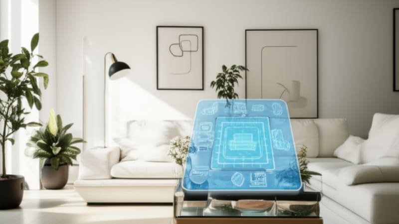
Need help visualizing how different color schemes might work in your space before committing to paint and furnishings? Try Room Vision AI to experiment with various color palettes in a digital twin of your own rooms.
Related Articles

Top AI Interior Design App Options Transforming Your Home Decor Choices
These apps harness artificial intelligence to generate personalized designs instantly, streamlining your journey from idea to reality. You don't need to be a design expert to use them.
Top 7 Virtual Staging Software Solutions to Transform Your Property Listings
Virtual staging software flips traditional staging on its head by letting you instantly transform empty rooms into warm, inviting spaces — all digitally. No sweat, no heavy lifting.

Top 7 Features to Look for in a Furniture Placement App
A furniture placement app takes the stress out by letting you try out designs virtually, so you won't waste time or money moving heavy pieces around. With some platforms, you can even blend AI-powered design tools with expert guidance.
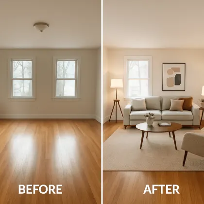
Ready to Transform Your Space?
See how your room would look with a completely new design. Our AI can help you visualize different styles in minutes.