Choosing the Right Paint Colors to Transform Your Home's Ambiance: A Complete Color Psychology Guide
Color is one of the most powerful tools in interior design, capable of completely transforming not just how a space looks, but how it feels. The colors we surround ourselves with can influence our mood, energy levels, productivity, and even our sleep quality. When choosing paint colors for your home, you're not just making an aesthetic decision—you're creating an environment that will impact your daily life.
Understanding color psychology isn't just about following trends—it's about creating spaces that support your lifestyle, enhance your well-being, and reflect your personality. This comprehensive guide will help you navigate the complex world of color selection to create the perfect ambiance in every room of your home.
The Science Behind Color Psychology

Color psychology is rooted in both science and cultural associations. Our responses to color are influenced by several factors:
Biological Responses
Wavelength Effects: Different colors have different wavelengths that trigger various neurological responses:
- Red (long wavelength) can increase heart rate and blood pressure
- Blue (short wavelength) tends to have a calming effect and can lower blood pressure
- Green (medium wavelength) is easiest on the eyes and promotes balance
Circadian Rhythm Impact: Colors can affect our natural sleep-wake cycles:
- Blue light suppresses melatonin production, keeping us alert
- Warm colors (reds, oranges, yellows) don't interfere with melatonin as much
- Cool colors can help create a more restful environment for sleep
Psychological Associations
Cultural Conditioning: Our color preferences are shaped by cultural associations:
- White represents purity in Western cultures but mourning in some Eastern traditions
- Red symbolizes luck in Chinese culture but danger in many Western contexts
- Green is associated with nature universally but has different cultural meanings
Personal Experiences: Individual memories and associations with colors affect our responses:
- Childhood bedroom colors may evoke comfort or negative memories
- Colors associated with positive experiences tend to be preferred
- Seasonal preferences often develop based on geographic location
Scientific Insight: Studies by the University of British Columbia found that blue environments enhance creative performance by 41%, while red environments improve attention to detail by 31%.
Understanding Color Temperature and Undertones

Before diving into specific colors, it's crucial to understand color temperature and undertones, as these subtle characteristics dramatically affect how colors feel in a space.
Color Temperature Basics
Warm Colors (2000K-3000K):
- Include reds, oranges, yellows, and warm whites
- Create cozy, intimate, energizing atmospheres
- Make spaces feel smaller and more enclosed
- Best for social areas and evening relaxation
Cool Colors (3500K-6500K):
- Include blues, greens, purples, and cool whites
- Create calm, spacious, refreshing atmospheres
- Make spaces feel larger and more open
- Best for concentration and morning activities
Neutral Colors:
- Can lean warm or cool depending on undertones
- Provide flexibility and work with various lighting conditions
- Serve as excellent backgrounds for accent colors
Understanding Undertones
Every paint color has undertones—subtle hints of other colors that may not be immediately apparent:
Warm Undertones:
- Yellow undertones: Create sunny, cheerful feelings
- Red undertones: Add energy and warmth
- Orange undertones: Provide comfort and sociability
Cool Undertones:
- Blue undertones: Create calm, sophisticated atmospheres
- Green undertones: Provide balance and tranquility
- Purple undertones: Add mystery and creativity
Room-by-Room Color Psychology Guide
Living Room: The Heart of Social Connection

The living room serves multiple functions—relaxation, entertainment, family time, and often work. Color choices should balance energy and calm.
Best Color Families:
Warm Neutrals (Beiges, Taupes, Warm Grays):
- Psychological Effect: Create welcoming, comfortable atmospheres
- Best For: Families who entertain frequently, traditional decor styles
- Popular Shades: Accessible Beige, Balanced Beige, Classic Gray
Earthy Greens:
- Psychological Effect: Promote balance, reduce eye strain, create connection to nature
- Best For: Stress reduction, homes with lots of natural light
- Popular Shades: Sage Green, Olive Green, Forest Green accents
Soft Blues:
- Psychological Effect: Lower stress levels, encourage conversation
- Best For: Formal living spaces, meditation areas
- Popular Shades: Palladian Blue, Sea Salt, Cloudy Sky
Energizing Accent Colors:
- Use on single accent walls or through accessories
- Coral or Peach: Stimulate conversation and appetite
- Deep Navy: Add sophistication and drama
- Mustard Yellow: Provide warmth and optimism
Bedroom: Your Personal Sanctuary

Bedroom colors should prioritize rest, relaxation, and personal comfort since this space impacts sleep quality.
Sleep-Promoting Colors:
Soft Blues:
- Scientific Backing: Studies show people in blue bedrooms get the most sleep (7 hours, 52 minutes average)
- Psychological Effect: Lower heart rate, reduce blood pressure
- Best Shades: Powder Blue, Sky Blue, Seafoam
Gentle Greens:
- Psychological Effect: Most restful color for the human eye
- Benefits: Reduce anxiety, promote natural sleep cycles
- Best Shades: Sage, Eucalyptus, Pale Green
Warm Neutrals:
- Psychological Effect: Create cocoon-like comfort
- Benefits: Timeless appeal, work with changing decor
- Best Shades: Cream, Mushroom, Warm White
Colors to Avoid in Bedrooms:
Bright Red:
- Increases heart rate and can interfere with sleep
- May increase feelings of aggression or restlessness
Bright Orange:
- Too stimulating for restful sleep
- Can increase mental activity when you need to wind down
Bright Yellow:
- Can cause eye strain and mental stimulation
- May trigger anxiety in large doses
Sleep Science: Research by travel company Travelodge found that people with blue bedrooms sleep an average of 52 minutes longer than those with other colors. Purple bedrooms resulted in the least sleep at just under 6 hours per night.
Kitchen: The Hub of Nourishment and Gathering

Kitchen colors should stimulate appetite, encourage social interaction, and create an energizing atmosphere for meal preparation.
Appetite-Stimulating Colors:
Warm Reds:
- Psychological Effect: Increase appetite and energy
- Best Application: Accent walls, backsplashes, or cabinetry
- Complementary Colors: Cream, white, natural wood tones
Sunny Yellows:
- Psychological Effect: Create cheerful, welcoming atmosphere
- Benefits: Make kitchens feel larger and brighter
- Best Shades: Buttercream, Pale Yellow, Lemon Chiffon
Earthy Oranges:
- Psychological Effect: Stimulate conversation and appetite
- Best Application: As accents with neutral backgrounds
- Complementary Colors: Sage green, cream, warm gray
Clean and Fresh Options:
Crisp Whites:
- Psychological Effect: Create perception of cleanliness
- Benefits: Timeless, works with any accent color
- Considerations: Can feel cold without warm accents
Soft Greens:
- Psychological Effect: Create fresh, natural feeling
- Benefits: Easy on the eyes, promote healthy eating
- Best Shades: Mint, Seafoam, Pale Sage
Home Office: Productivity and Focus

Office colors should enhance concentration, reduce fatigue, and support the type of work being performed.
Concentration-Enhancing Colors:
Blues for Focus:
- Scientific Research: Blue enhances mental performance and concentration
- Best For: Detail-oriented work, studying, financial tasks
- Recommended Shades: Steel Blue, Slate Blue, Powder Blue
Greens for Balance:
- Psychological Effect: Reduce eye strain, promote balance
- Best For: Long work sessions, creative tasks requiring sustained attention
- Recommended Shades: Sage, Forest Green, Seafoam
Energizing Colors for Creativity:
Purple for Innovation:
- Psychological Effect: Stimulates creativity and imagination
- Best Application: Accent walls or accessories
- Complementary Colors: Gray, white, soft green
Yellow for Mental Stimulation:
- Psychological Effect: Increases mental activity and alertness
- Best Application: Small doses or as accents
- Caution: Can cause fatigue if overused
Bathroom: Cleanliness and Rejuvenation

Bathroom colors should promote cleanliness, relaxation, and prepare you for the day ahead or help you unwind.
Spa-Like Serenity:
Soft Aquas:
- Psychological Effect: Promote cleanliness, tranquility
- Benefits: Create spa-like atmosphere, work well with white fixtures
- Best Shades: Aqua Mist, Sea Glass, Pale Turquoise
Clean Whites:
- Psychological Effect: Ultimate cleanliness perception
- Benefits: Timeless, reflect light, make spaces feel larger
- Enhancement: Add warmth with natural materials and soft lighting
Energizing Morning Colors:
Soft Corals:
- Psychological Effect: Gentle energy boost, flattering to skin tones
- Benefits: Create warmth without being overwhelming
- Best Application: Accent walls with white trim
Current Color Trends and Their Psychology
2025 Popular Interior Paint Shades

Warm Minimalism:
- Mushroom Gray: Sophisticated neutral with warm undertones
- Creamy Off-White: Softer alternative to stark white
- Warm Beige: Classic comfort with modern appeal
Nature-Inspired Hues:
- Sage Green: Calming, natural, works in any room
- Terracotta: Earthy warmth, perfect for accent walls
- Deep Forest Green: Rich, grounding, luxurious feeling
Bold but Balanced:
- Navy Blue: Sophisticated alternative to black
- Dusty Rose: Soft pink that's grown-up and calming
- Charcoal Gray: Modern, versatile, pairs well with any accent
Timeless vs. Trendy Considerations
Invest in Timeless for:
- Main wall colors throughout the home
- Large, expensive areas to paint (high ceilings, extensive square footage)
- Rooms you plan to keep the same for years
Experiment with Trends for:
- Accent walls
- Powder rooms or smaller spaces
- Areas where paint changes are easier and less expensive
The Impact of Lighting on Color Perception
Natural Light Considerations

Directional Light Quality:
North-Facing Rooms:
- Receive cool, consistent light throughout the day
- Colors appear more muted and cool
- Solution: Choose warmer paint colors to compensate
South-Facing Rooms:
- Receive bright, warm light that changes throughout the day
- Colors appear more vibrant and warm
- Solution: Cooler colors can balance intense warm light
East-Facing Rooms:
- Bright, cool morning light, darker in afternoon
- Solution: Warm colors help in afternoon, cool colors balance morning light
West-Facing Rooms:
- Receive intense afternoon and evening light
- Can make warm colors appear too intense
- Solution: Cool or neutral colors prevent overwhelming warmth
Artificial Lighting Effects
Incandescent Bulbs (2700K):
- Enhance reds and yellows
- Make blues and greens appear muddy
- Best With: Warm color schemes
LED Bulbs (Variable):
- Available in multiple color temperatures
- Warm LEDs (2700K-3000K): Similar to incandescent
- Cool LEDs (4000K-6500K): Enhance blues and greens
Fluorescent Lighting:
- Can create unflattering green cast
- Solution: Choose warm fluorescents or add warm accent lighting
Lighting Test: Always test paint colors under the actual lighting conditions they'll be viewed in. Paint large swatches and observe them at different times of day before making final decisions.
Creating Successful Color Schemes
The 60-30-10 Rule

This classic interior design principle creates balanced, visually pleasing color schemes:
60% - Dominant Color:
- Usually the wall color
- Should be the most neutral and calming
- Sets the overall mood of the room
30% - Secondary Color:
- Furniture, window treatments, area rugs
- Can be bolder than the dominant color
- Adds personality and interest
10% - Accent Color:
- Accessories, artwork, pillows
- Can be the boldest color in the scheme
- Easy to change for seasonal updates
Color Harmony Principles
Monochromatic Schemes:
- Use different shades, tints, and tones of one color
- Benefits: Sophisticated, calming, cohesive
- Enhancement: Add texture and pattern for visual interest
Analogous Schemes:
- Use colors next to each other on the color wheel
- Benefits: Natural, harmonious, easy on the eyes
- Examples: Blue-green-purple, red-orange-yellow
Complementary Schemes:
- Use colors opposite each other on the color wheel
- Benefits: High contrast, vibrant, energizing
- Application: Use one as dominant, the other as accent
Triadic Schemes:
- Use three colors equally spaced on the color wheel
- Benefits: Vibrant yet balanced
- Application: Choose one dominant color, use others as accents
Special Considerations for Color Selection
Open Floor Plans

Open floor plans require special attention to color flow:
Color Transitions:
- Use varying intensities of the same color family
- Example: Light blue in living area, medium blue in dining, deep blue accent wall in kitchen
Unifying Elements:
- Repeat accent colors throughout the space
- Use consistent trim and ceiling colors
- Maintain similar color temperatures
Zone Definition:
- Use subtle color changes to define functional areas
- Avoid abrupt color changes that feel jarring
- Consider using different finishes (matte, satin) of the same color
Small Spaces
Light Reflection:
- Light colors reflect more light, making spaces feel larger
- Best Options: Off-whites, pale blues, soft greens
Monochromatic Approaches:
- Painting walls, trim, and ceiling the same color eliminates visual boundaries
- Creates seamless, spacious feeling
Strategic Dark Colors:
- Despite conventional wisdom, dark colors can work in small spaces
- Application: Creates cocoon-like intimacy
- Key: Ensure adequate lighting
Homes with Children
Practical Considerations:
- Choose washable paint finishes (satin or semi-gloss)
- Consider stain-resistant paint formulations
- Plan for frequent touch-ups
Psychological Benefits:
- Soft blues and greens: Promote calm behavior
- Avoid overly bright colors: Can increase hyperactivity
- Include personality: Let children help choose accent colors for their spaces
Color Selection Process: Step-by-Step Guide
Phase 1: Assessment and Planning
Evaluate Your Space:
- Note natural light direction and quality
- Identify fixed elements (flooring, countertops, built-ins)
- Consider room function and how you want to feel in the space
- Assess architectural features you want to highlight or downplay
Define Your Goals:
- Do you want to make the space feel larger or cozier?
- Are you looking to increase energy or promote relaxation?
- Do you want to highlight architectural features?
- Are you trying to unify an open floor plan?
Phase 2: Color Exploration
Gather Inspiration:
- Create a mood board with images that inspire you
- Consider colors from favorite artwork, textiles, or nature
- Look at professional design photos for color combination ideas
Test Paint Samples:
- Purchase sample sizes of 3-5 colors you're considering
- Paint 2x2 foot swatches on different walls
- Observe samples at different times of day and in various lighting conditions
- Live with samples for at least a week before deciding
Phase 3: Implementation Strategy
Start with a Plan:
- Decide on color flow between connected rooms
- Choose finishes appropriate for each surface
- Plan the painting order (ceiling, walls, trim)
Professional Tips:
- Prime walls, especially when making dramatic color changes
- Use high-quality brushes and rollers for even coverage
- Apply multiple thin coats rather than one thick coat
Common Color Selection Mistakes and Solutions
Mistake 1: Choosing Colors in Store Lighting
Problem: Store lighting doesn't match your home's lighting conditions Solution: Always test colors in your actual space under your lighting conditions
Mistake 2: Ignoring Undertones
Problem: Colors clash unexpectedly due to conflicting undertones Solution: Test all colors together and identify undertones before committing
Mistake 3: Not Considering Fixed Elements
Problem: New paint colors don't work with existing flooring, countertops, or furniture Solution: Start with your fixed elements and build your color scheme around them
Mistake 4: Following Trends Without Personal Consideration
Problem: Trendy colors that don't suit your lifestyle or preferences Solution: Use trends as inspiration but choose colors that genuinely appeal to you
Mistake 5: Painting the Entire House the Same Color
Problem: Monotonous feeling throughout the home Solution: Create intentional color flow with variations in intensity and complementary colors
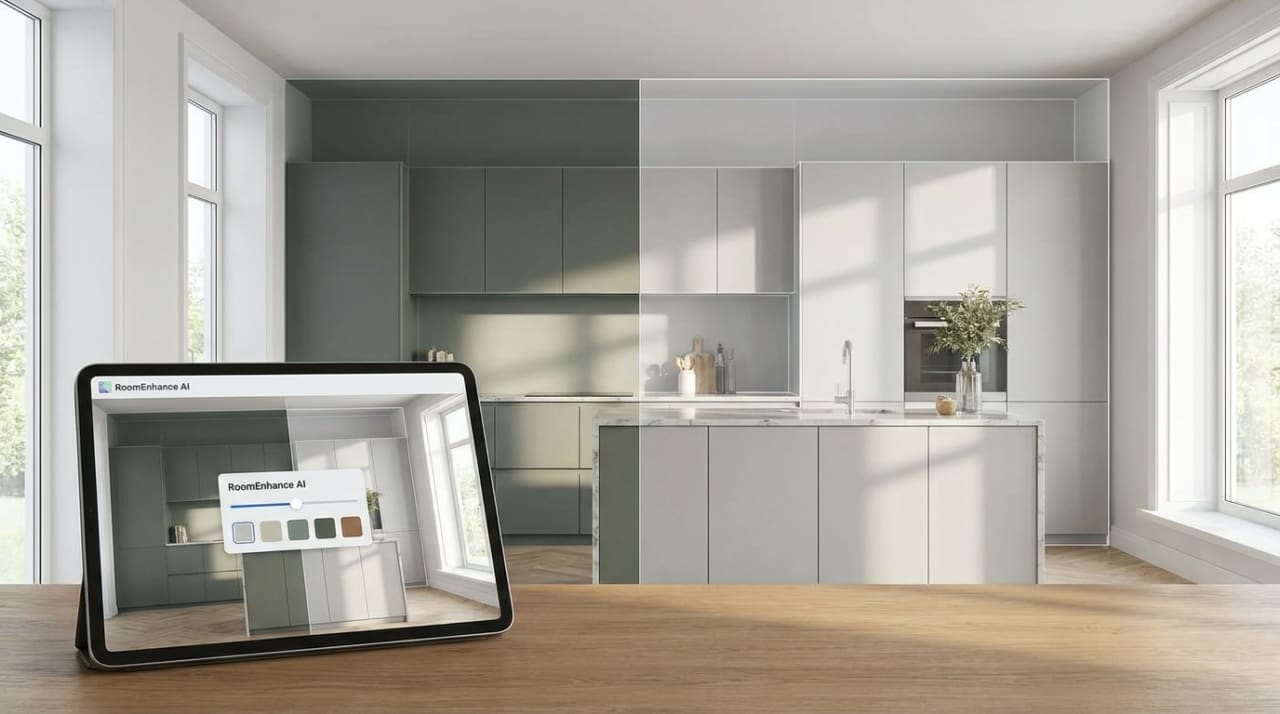
Visualizing Your Color Choices
Before committing to any paint color, it's valuable to see how your choices will look in your actual space. While paint samples help, full-room visualization can prevent costly mistakes.
Want to see how different paint colors will transform your rooms before buying paint? Try Room Enhance AI to experiment with various color schemes and see realistic visualizations of your space with different paint colors applied.
Conclusion
Choosing the right paint colors is both an art and a science. By understanding color psychology, considering your home's unique characteristics, and thinking carefully about how you want each space to feel, you can create environments that truly support your lifestyle and well-being.
Remember that color is deeply personal—while psychology provides guidelines, your individual preferences and experiences should ultimately guide your decisions. The best color choices are those that make you feel comfortable, happy, and at home in your space.
Take time with your color selection process. Paint is one of the most cost-effective ways to transform your home, but rushing the decision can lead to results you'll live with for years. By following the principles outlined in this guide and trusting your instincts, you'll create a home that not only looks beautiful but feels perfectly suited to you.
The power of color to transform your home's ambiance is remarkable. With thoughtful consideration and proper planning, your paint color choices will enhance your daily life and create the atmosphere you've been dreaming of.
Quick Reference: Color Psychology by Room
Living Room
- Warm neutrals: Welcoming, comfortable
- Soft blues: Calming, conversational
- Earthy greens: Balanced, natural
Bedroom
- Soft blues: Promote sleep, reduce stress
- Gentle greens: Most restful for eyes
- Warm neutrals: Cozy, timeless
Kitchen
- Warm reds: Stimulate appetite
- Sunny yellows: Cheerful, energizing
- Crisp whites: Clean, fresh
Home Office
- Blues: Enhance concentration
- Greens: Reduce eye strain
- Purple accents: Boost creativity
Bathroom
- Soft aquas: Spa-like tranquility
- Clean whites: Ultimate cleanliness
- Soft corals: Gentle morning energy
Frequently Asked Questions
Q: How do I choose between warm and cool colors for my living room?
A: Consider your room's natural light and desired atmosphere. North-facing rooms benefit from warm colors to compensate for cool light, while south-facing rooms can handle cooler colors. For atmosphere, warm colors create coziness and intimacy, while cool colors feel more spacious and serene.
Q: Can dark colors work in small rooms?
A: Yes, when used strategically. Dark colors can create a cozy, intimate feeling in small spaces. The key is ensuring adequate lighting and considering the room's function. Bedrooms can handle darker colors well, while home offices might benefit from lighter, more energizing options.
Q: How do I test paint colors effectively?
A: Paint 2x2 foot swatches on different walls in your room. Observe them in morning, afternoon, and evening light over at least a week. Compare them against your existing furniture and fixed elements. Take photos in different lighting to see how they appear on camera.
Q: Should I paint the ceiling the same color as the walls?
A: This can work well in several situations: to make small rooms feel larger, to create a cozy cocoon effect, or to modernize a space. However, traditional white or off-white ceilings can make rooms feel taller and more formal. Consider your goals and room proportions.
Q: How do I create color flow between rooms in an open floor plan?
A: Use variations of the same color family (light blue to medium blue to navy), repeat accent colors throughout the space, or use the same neutral base with different accent colors in each area. Maintain consistent undertones and color temperatures for harmony.
Q: What's the best way to incorporate trending colors without dating my home?
A: Use trendy colors as accents through accessories, single accent walls, or smaller spaces like powder rooms. Keep major surfaces in more timeless colors. This allows you to update trends easily without major repainting projects.